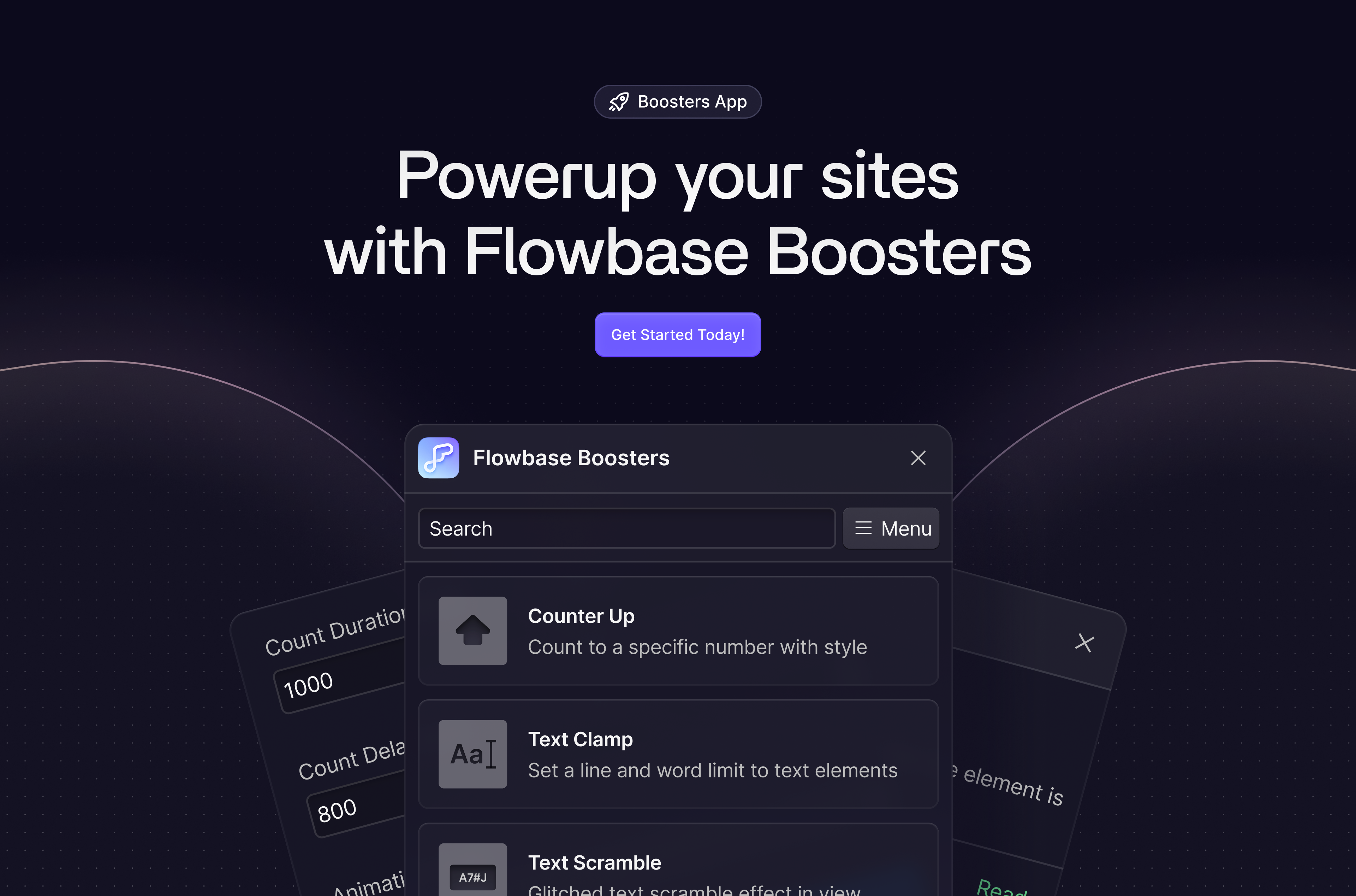
Modals are a great way to direct your website users’ attention to an important action or piece of information. They are also surprisingly simple to build in Webflow using interactions.
In UI design, modals refer to a type of interface element that appears on top of the current page or view, typically as a window or dialog box. They are used to display important information or prompts that require the user's attention, such as confirmation messages, forms, and settings. Modals are often used for actions that have a significant impact on the user's experience, such as deleting an item or making a purchase. They can also be used to provide additional information or context, such as a detailed view of an item or a tutorial. Modals are designed to be non-disruptive and can be closed by the user at any time, allowing them to return to their previous task.
1. Add the Modal Wrapper
- Add a new div to your page.
- Set display to flex justify & align center.
- Set position to fixed, cover and a high z-index. This ensures the modal will always stay on top of the users screen regardless of scrolling.

2. Modal Background
- Add a new div inside the modal wrapper
- Set position to absolute and cover
- Set a background color with a low opacity. By setting a low opacity, the page content below the modal will be visible but have a grayed out appearance

3. Add the Modal Card
- Add another div inside the modal wrapper for your modal card
- Set position relative so the card will sit above the modal background.
- Add your content and style this however you want.

That’s it for the structure. Now lets add interactions to show and hide on mouse click.
4. Using interactions to close the modal
- Click on the close icon button. With the button selected, navigate to interactions on the top right of the style panel and add a new mouse click element trigger
- Create a new animation
- Select the modal wrapper. With the modal wrapper selected, select Hide/Show Animation
- Set the modal’s display to hidden and click save
- Apply same interaction to the background
You only need to apply the animation on first click, refered to 'Mouse click (tap)'


5. Open the modal
- Now that we are done working with the modal, set the modal wrapper to hidden.
- Add a button anywhere on your page that the user will click on to open the modal.
- Follow the same steps as created the close interaction but instead set the display to flex.


That’s it! In preview mode, you should now be able to open and close the modal.


